Allan Day, UX Designer at Red Hat and GNOME contributor, posted an updated set of designs for the GNOME Files app, which he calls Nautilus Next.
In the mockups (this is not real code yet and it can change later on), a new lists and grids design is presented, in which:
- the thumbnails are larger and clearer;
- the grids are responsive;
- the lists have thumbnails and separators between rows to aid readability.
There's also a mockup for the view menu which has the same options available in the current Nautilus but with nicer controls:
The preview feature will suffer changes too. In the new Nautilus Next mockups, previews are much more central to the browsing experience and they include actions such as copy, move, open, share and more, all from the preview:
This isn't visible in the mockups, but you'll also be able to navigate to the previous and next item from the preview.
The places / sidebar will also be redesigned in Nautilus Next and the goal is to include "more things you care about, less things you don't". For this, adding drives to the sidebar will become a manual action so you can customize the sidebar to your needs:
Allan Day's article also includes mockups for a new "selection mode" which is basically a discoverable context menu. This design is already used in other GNOME3 applications and it looks like it will be included in Nautilus Next too:
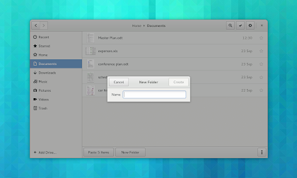
The new selection mode is part of a larger goal to make "undiscoverable conventions that we acclimatise ourselves to" easier to discover for new users. For example, here's the New Folder dialog - also notice the "New Folder" and "Paste 5 items" buttons at the bottom of the Files window:
And finally, a new content selection dialog will be added - this isn't a direct Nautilus feature but it's part of it because it allows to select content from a range of sources, either local or stored in the cloud, Nautilus (Files) being one of them:
What do you think?
via / more info: afaikblog


